
Last updated: September 24, 2026
Consistent cannabis packaging color does not come from choosing a Pantone number and asking a printer to “match it.” The result depends on the complete production stack: artwork color method, substrate color, ink system, white underprint, print process, lamination or coating, viewing light and the physical reference used for approval. For a critical brand color, define the target before production, approve it on the actual material and finish, keep a signed physical master, and write the measurement method and tolerance into the specification. Use CMYK for photographs and complex process artwork, consider Pantone spot color for critical solids when the production method supports it, and use Delta E only with a defined formula, instrument condition, sample location and project-specific tolerance. Repeat orders should be compared against the same approved master—not against a phone photo or a previous PDF.
Color disputes are unusually expensive in cannabis packaging because a single brand may run the same identity across flower pouches, kraft pre-roll boxes, glossy vape cartons, rigid concentrate boxes and variable strain labels.
The artwork can use the same green, purple or red on every SKU while the finished packaging looks noticeably different on shelf.
That does not automatically mean the printer made a mistake.
A color printed on white coated paperboard behaves differently from the same ink on brown kraft. Soft-touch lamination changes surface reflection. Metallized film changes the optical background. Clear flexible packaging may require white ink under the artwork. A physical Pantone chip, a calibrated proof and a backlit laptop screen are three different references.
The practical goal is therefore not “make every material mathematically identical.” It is to create a color-control system that tells the brand, designer and packaging supplier exactly what must match, what can vary, and how a production lot will be accepted.
Why Cannabis Packaging Colors Change Between Samples
When a finished package does not look like the artwork on screen, the screen is often blamed first. In reality, color moves through several conversions before a box or pouch reaches the shelf.
| Stage | What Can Change | Typical Buyer Mistake | Better Control |
|---|---|---|---|
| Design screen | Monitor brightness, calibration, RGB display gamut | Approving color from a laptop or phone | Use the screen for layout; use a defined print reference for production color |
| Artwork conversion | RGB-to-CMYK conversion, spot-color conversion, profiles | Assuming HEX, RGB, CMYK and Pantone are interchangeable | Lock the intended print color method in the artwork |
| Substrate | Whiteness, kraft tone, gloss, texture, absorption, opacity | Approving on white stock and producing on kraft | Approve critical colors on the actual production substrate |
| Ink / white underprint | Ink strength, opacity, formulation, white-ink coverage | Ignoring the background under flexible-film graphics | Specify white underprint location and opacity where relevant |
| Printing process | Offset, flexo, gravure, digital and spot ink reproduce differently | Using a proof from one process to guarantee another | State what the proof is intended to predict |
| Finish | Gloss, matte, soft-touch and varnish change reflected light | Approving color before final coating | Review high-risk colors after the intended finish |
| Viewing light | Two colors may match under one light and separate under another | Approving beside a warehouse window or under mixed LEDs | Define a controlled viewing condition for formal approval |
Pantone specifically notes that the same Pantone ink can appear different on coated and uncoated papers because the surfaces absorb and reflect ink differently. See Pantone's explanation of coated and uncoated references.
For cannabis brands, that principle matters whenever one identity is applied to multiple package structures. A dark green that looks rich on a coated vape carton can appear muted on natural kraft. The same artwork on a metallized pouch can shift again because reflective film changes the optical background.
Pantone vs. CMYK: Which Should You Use?
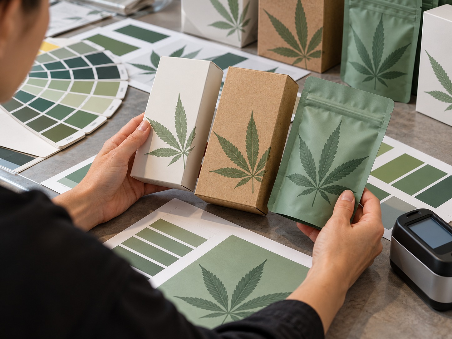
Neither system is automatically “better.” They solve different production problems.
| Artwork Need | Usually Better Starting Point | Why | What Still Needs Approval |
|---|---|---|---|
| Critical solid brand color | Pantone / spot ink when supported | Creates a named, dedicated ink target rather than building the solid from four process inks | Actual substrate, finish and physical result |
| Photography | CMYK | Designed for multi-color process reproduction | Profile, paper, black handling and proof |
| Complex illustrations and gradients | CMYK or an approved expanded-gamut workflow | Efficient for many colors and tonal transitions | Gamut limitations and critical spot accents |
| Simple logo + photography | CMYK plus a spot color where justified | Protects a critical logo while keeping images practical | Cost, press capability and overprint behavior |
| Many cannabis strain colorways | Depends on volume and production method | Digital or process workflows may simplify frequent SKU changes | Family consistency and repeat-order master |
Pantone describes spot printing as using dedicated inks, while four-color process printing creates colors through CMYK combinations. Its official overview of spot versus process color is useful when deciding how a critical brand color should be specified.
Do not convert a HEX code and assume the job is finished
A cannabis startup may begin with a website palette such as a HEX value selected for a logo. That value describes screen color, not a physical ink formula on a specific package.
Conversion tools can provide a starting point, but the packaging team still needs to evaluate the achievable printed result.
Use spot color selectively
A dedicated spot ink can make sense for a signature logo or high-value solid. It is less useful when nearly the entire design consists of photographs, gradients and changing strain graphics.
Do not pay for extra spot colors simply because the design file contains several named swatches. Decide which colors actually need tighter control.
What Delta E Actually Tells You
Delta E, written as ΔE, expresses the numerical difference between two measured colors.
A smaller result means the two measured samples are closer under the selected calculation method. A larger result means they are farther apart.
That sounds like a simple pass/fail tool, but a Delta E number without context is incomplete.
A usable color specification also identifies the reference, Delta E formula, measuring conditions, material, measurement location, sample count and acceptance rule.
Why there is no universal Delta E number for every cannabis package
A rigid matte-black concentrate box and a high-gloss white vape carton do not have identical measurement conditions. Nor do a tiny printed warning symbol and a large solid brand panel.
Instead of copying a tolerance from another packaging project, write the method around your actual construction.
| Specification Item | What to Record |
|---|---|
| Reference | Approved physical sample, spectral data or another named master |
| Formula | The agreed color-difference formula, such as CIEDE2000 when applicable |
| Viewing / instrument condition | Illuminant, observer and other instrument settings agreed with the supplier |
| Backing | How the sample is backed during measurement |
| Location | Exact solid-color patches or measurement zones |
| Sampling | How many pieces and which points in the production run are checked |
| Tolerance | Project-specific agreed limit |
| Visual override | How metallics, texture, gloss or visually sensitive areas are judged when instrument data alone is insufficient |
ISO 12647-2 defines process-control parameters for four-color offset lithographic printing. It is useful technical context for offset work, but buyers should not convert one standard into a universal acceptance number for every package material or printing process. See ISO 12647-2:2013.
A useful real product example
420 Packaging's current Custom 510 Vape Cartridge Box with Window & Tamper-Evident Peel Seal lists a quality specification of ΔE ≤ 2 under D50 on its product page.
That is useful as a product-specific supplier specification. It should not be copied automatically into a kraft box, flexible pouch or unrelated print process. Confirm the applicable tolerance in the quotation and approved sample for the exact package you order.
Why Kraft, SBS, Film and Rigid Boxes Do Not Match the Same Way
Substrate is not a neutral carrier. It becomes part of the final color.
White SBS / C1S paperboard
A bright coated white surface gives process inks a relatively predictable visual base. It is commonly used for retail cartons where photographs, gradients and vivid colors matter.
Natural kraft
Kraft introduces a brown background and natural material variation. Light colors can become muted, and a brand should decide whether the goal is exact cross-material matching or an intentionally kraft-adapted version of the identity.
If a brand insists that a kraft carton look exactly like a coated white carton, it may require white underprinting or a different construction—and even then the surfaces can still read differently.
Clear or metallized flexible film
The same CMYK values can appear very different depending on whether ink sits over opaque white ink, transparent film or reflective metallization.
For color-critical pouches, include white-underprint layers in artwork approval and do not approve color from a flattened PDF that hides the print sequence.
Rigid wrapped boxes
Rigid cannabis packaging adds another layer because printed wrap paper is mounted over greyboard. Soft-touch film, matte lamination, embossing, foil and textured papers can all alter perceived color.
| Material | Main Color Variable | What to Approve Physically | Common Cannabis Use |
|---|---|---|---|
| White SBS / C1S | Coating, ink density and finish | Printed board with final lamination or coating | Vape cartons, edible cartons, pre-roll cartons |
| Natural kraft | Brown base color and stock variation | Actual kraft lot or agreed range | Pre-roll boxes, eco-positioned secondary packaging |
| Flexible film | White ink, transparency and metallization | Final laminate structure and print sequence | Flower and edible pouches |
| Rigid wrapped box | Wrap paper plus film / coating / texture | Complete finished sample | Concentrates, premium vape kits, limited editions |
The 5-Level Proof Ladder
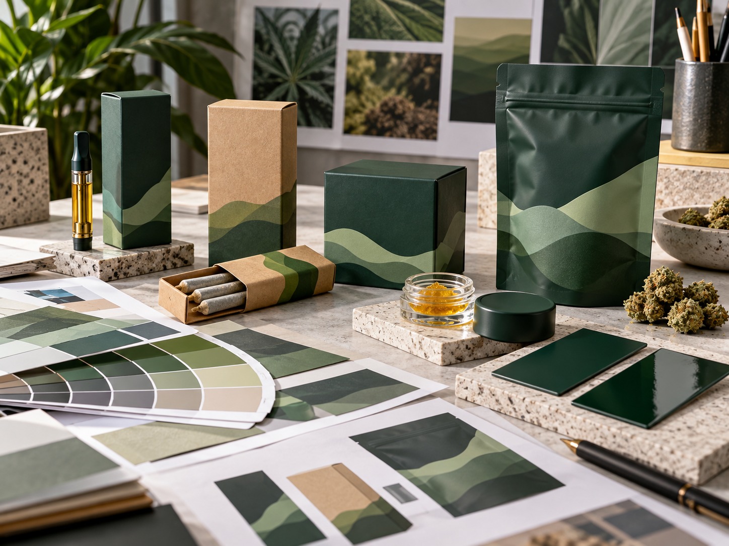
One reason packaging color disputes happen is that every sample gets called a “proof,” even though different proofs answer different questions.
Level 1: Digital content proof
Use it to verify:
- copy;
- dieline;
- warning placement;
- barcode and QR location;
- image selection;
- artwork revision.
Do not use a screen PDF as the sole color master.
Level 2: Color-target approval
Agree on the intended reference for each critical color: Pantone reference, measured values or an approved physical sample.
Level 3: Material-specific sample
Print the critical color on the actual or production-equivalent material. This stage exposes problems caused by kraft tone, coated stock, white ink, transparent film or specialty paper.
Level 4: Finished production-intent sample
Add the planned lamination, varnish, soft-touch, foil or other finish.
This is where the package begins to represent what a shopper will actually see.
Level 5: Signed golden sample
Keep a labeled physical reference showing:
- project name;
- SKU;
- artwork revision;
- date;
- substrate;
- print method;
- finish;
- approval status.
420 Packaging's existing Cannabis Packaging Sample Checklist explains how to retain a golden sample and approve the wider package structure, fit, closure, print and finish before mass production.
A Practical Cannabis Packaging Color Approval Workflow
Step 1: Mark critical and noncritical colors
Do not spend equal control effort on every pixel.
Create two groups:
- Critical: primary brand color, logo solid, strain-family identifier, required symbol if color-specific, hero front-panel color.
- Noncritical: photographic variation, background texture, minor illustration, intentionally variable organic pattern.
Step 2: Freeze the substrate before color approval
Do not approve a color and then switch from SBS to kraft, from matte to soft-touch, or from clear film to metallized film without rechecking it.
Step 3: State the print method
Record whether each critical element is:
- CMYK process;
- Pantone / spot;
- white underprint plus process;
- foil;
- another specialty process.
Step 4: Review under controlled light
For formal print comparison, use a consistent viewing condition rather than moving between daylight, warm office lamps and phone-camera photos.
Pantone recommends controlled visual evaluation for accurate comparison and identifies D50 lighting for printed-ink evaluation in its color-comparison guidance. See Pantone's visual comparison guidance.
Step 5: Check appearance after finishing
Compare the actual finished package, not only the wet ink or unfinished board.
A soft-touch surface may reduce apparent saturation. Gloss can deepen contrast. Embossing and foil change how adjacent areas catch light.
For finish selection, use the site's Cannabis Packaging Finishes and Production Guide separately; this article focuses on controlling color rather than choosing decorative processes.
Step 6: Record measurable acceptance where needed
When a brand color is sufficiently important to justify instrumental control, write the entire measurement method into the quality agreement.
Step 7: Retain approved samples from production
Keep samples from the released lot for future reorder comparison.
How to Control Color Across Strains and Multiple SKUs
Cannabis packaging frequently uses color as a navigation system.
One strain may be purple, another blue, another orange, while a master black, white or green brand color remains constant across the entire family.
This creates two separate color-control jobs.
| Color Layer | Purpose | Recommended Control |
|---|---|---|
| Master brand color | Signals the parent brand across every SKU | Use one stable reference and tighter change control |
| SKU / strain color | Differentiates individual products | Maintain a named SKU palette and artwork revision |
| Compliance color | Supports required symbol, warning or readability | Follow the target-market rule rather than brand preference |
| Variable data | Batch, lot, potency, date or retailer information | Prioritize legibility and scanning over decorative matching |
Use a master + accent system
A practical architecture keeps one or two colors tightly controlled across the brand while allowing SKU accents to change.
This reduces the number of colors that must be measured and repeatedly approved.
Do not allow every strain file to redefine the master color
If ten designers independently copy a logo color into ten files, small artwork changes can become production differences.
Use one controlled brand-color definition across every dieline.
Compare SKUs together, not one at a time
A color can look acceptable in isolation but create confusion when placed beside another SKU.
Line up the full range under the same light and check whether:
- the parent brand remains visually consistent;
- strain colors are clearly distinguishable;
- medical or compliance information remains readable;
- one SKU does not accidentally look like a faded version of another.
Color Control for Warnings, QR Codes and Compliance Panels
Color consistency is not only a branding problem.
Low contrast can affect readability, and decorative finishes can interfere with machine-readable information.
Protect required information first
Keep required warnings, batch data and product identity on surfaces where the chosen color and finish remain readable.
Do not place small required copy across highly reflective foil, busy artwork or an unstable light-to-dark transition merely to preserve a design concept.
QR and barcode zones need their own approval
The site's Cannabis Packaging QR Code Prepress Guide recommends testing codes on finished packaging under real viewing conditions rather than assuming a code that works on screen will scan after printing.
Color changes can alter contrast, especially when a designer replaces a dark code with a brand color or places the code over kraft, metallic film or a tinted background.
Separate color compliance from child-resistant claims
Changing ink, paper or lamination may alter appearance without changing the mechanical structure. But when customization also changes thickness, friction or closure geometry, review whether the tested child-resistant configuration still applies.
The visual approval process should therefore sit inside the wider packaging approval workflow, not replace it.
How to Check Color During Mass Production
A perfect pre-production sample does not guarantee that the full order remains stable from first sheet to last.
Use a written run-sampling plan.
| Production Point | What to Check | Why It Matters |
|---|---|---|
| Startup | Critical solid colors, registration, ink balance, substrate | Confirms the press has reached the approved condition |
| Early run | Color measurement and visual comparison | Catches drift after initial setup |
| Middle | Same measurement locations and finish condition | Shows whether the process remains stable |
| Late run | Color, density / appearance and material condition | Identifies end-of-run change |
| After finishing | Appearance under final laminate, varnish or soft-touch | The customer receives the finished package, not the unfinished print |
| Packed cartons | Mix samples from several shipping cartons | Reduces the chance of approving only one part of the lot |
Measure the same place every time
Do not compare one sample on a large solid panel with another sample on a gradient, fold or textured area.
Define stable measurement zones in the artwork or quality specification.
Separate color drift from scuff damage
A panel can look lighter because ink was abraded during packing rather than because it printed incorrectly.
If the problem appears after carton-to-carton contact or shipping, use the site's Cannabis Packaging Rub Test to investigate abrasion separately from initial color accuracy.
Retain the first accepted lot
Keep sealed, protected samples from the released production run. They become valuable when a buyer says the next reorder “looks different.”
How to Prevent Repeat-Order Color Drift
Repeat orders are where a real color-control system proves its value.
If the only instruction on the reorder is “same as last time,” the supplier may not know which part of the previous result was actually approved.
Reference a controlled master
Your reorder should identify:
- artwork revision;
- approved physical sample ID;
- substrate;
- print method;
- Pantone / CMYK definition;
- white-underprint requirement;
- lamination or coating;
- foil and special finishes;
- measurement method where applicable.
Control material substitutions
Require approval before changing paper mill, film structure, ink, coating, lamination, production location or another component that materially affects the printed result.
The existing Cannabis Packaging Supplier Guide covers supplier change control, documentation and signed approval samples in more detail.
Do not use an old phone photo as a master
A photo adds camera processing, screen display variation and lighting differences. It is excellent for documenting damage or layout, but weak as a production color standard.
Replace aging physical references
Physical references can fade, yellow, become dirty or acquire surface damage. Store masters protected from light, heat, moisture and frequent handling, and maintain a controlled replacement process.
Color Approval Decision Matrix
| Situation | Minimum Practical Control | When to Add Instrument Measurement |
|---|---|---|
| One-time promotional carton | Finished physical proof + signed sample | If a critical corporate color must match other assets |
| Core cannabis brand used across many SKUs | Named master colors + physical master + substrate-specific samples | Useful for repeatability across runs and suppliers |
| Natural kraft pre-roll packaging | Actual kraft approval + agreed visual range | When printed solids must stay within a defined brand tolerance |
| Metallized or clear flexible pouch | Final laminate sample + white-underprint approval | For stable solid-color comparison on controlled measurement patches |
| Premium rigid concentrate box | Complete finished sample with wrap, lamination and foil | For measurable printed solids; evaluate foil and texture visually as well |
| Reorders over a long period | Protected golden sample + written specification | Strongly useful when supplier, press or material lots change |
420 Packaging Options for Color-Critical Projects
The package structure changes the way color must be controlled. These current 420 Packaging products represent three very different surfaces—white folding carton, natural kraft and premium rigid packaging—making them useful examples when building a substrate-specific approval plan.
Custom 510 Vape Cartridge Boxes with Window & Tamper-Evident Peel Seal

This folding-carton format is especially suitable for color-critical retail programs because the official specification supports CMYK or Pantone printing, inside and outside printing, matte or gloss lamination, soft-touch, spot UV, hot foil, embossing and debossing.
| Use case | Single 0.5 mL / 1.0 mL 510-thread cartridge |
|---|---|
| Board | 300–400 gsm SBS/C1S or kraft; optional 1.5–2.0 mm rigid wrap |
| Printing | CMYK or Pantone; inside and outside printing available |
| Finishes | Matte / gloss lamination, soft-touch, spot UV, hot foil, emboss / deboss |
| MOQ | 1,000 units; product page notes pilot runs may be available on request |
| Listed quality specification | ΔE ≤ 2 under D50; confirm applicability to the exact quotation and construction |
Child-Resistant Kraft Paper Pre-Roll Packaging Box
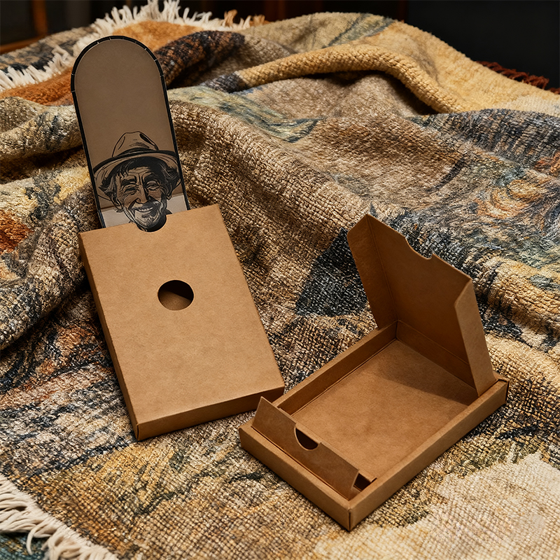
Kraft is a useful reminder that exact-looking color across substrates is not automatic. The product uses natural kraft paperboard and supports customized brand colors, CMYK / Pantone printing, logos, graphics, warning icons and compliance text.
| Application | Pre-roll / pre-rolled cone packaging |
|---|---|
| Material | Natural kraft paperboard |
| Structure | Outer sleeve with sliding inner tray and locking tab |
| Capacity | Customizable to pre-roll size and count |
| Printing | CMYK / Pantone, logos, graphics, warnings and compliance text |
| Finish options | Matte / gloss varnish, soft-touch and spot finishes on request |
When approving a kraft version of an existing white-board brand identity, compare the physical samples side by side and decide whether the brand requires a close cross-material match or an intentionally kraft-adapted appearance.
5g Concentrate Violet Glass Packaging Box
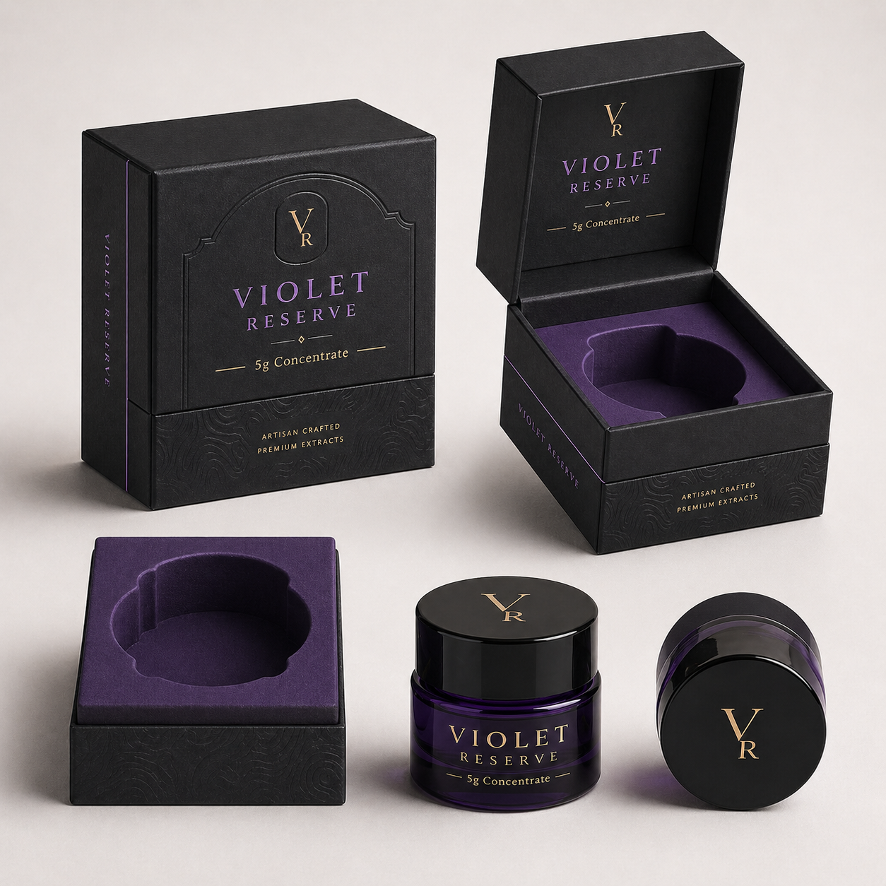
This premium rigid-paperboard format shows why the complete finish stack must be approved. The official product page supports CMYK, Pantone, metallic foil, matte lamination, soft-touch, textured paper, spot UV, embossing and debossing.
| Compatible product | 5g violet glass concentrate jar |
|---|---|
| Box type | Rigid paper box / setup box / custom hinged box |
| Insert | Paper, foam, EVA or molded tray |
| Printing | CMYK, Pantone and custom artwork printing |
| Finish options | Matte, soft-touch, textured paper, spot UV, emboss / deboss, foil stamping |
| MOQ | 1,000 pieces |
Approve this type of packaging after the wrap paper and intended finish have been applied. Judging only an unfinished printed sheet will not reproduce the final shelf appearance.
Packaging Color QA Checklist Before Production
| Check | Question Before Approval |
|---|---|
| Artwork | Are critical colors clearly identified as CMYK, Pantone or another defined process? |
| RGB / HEX | Have screen-only values been converted and physically evaluated rather than treated as print guarantees? |
| Substrate | Is the proof printed on the actual or production-equivalent material? |
| White ink | For clear / metallic flexible structures, is the white-underprint layer documented? |
| Finish | Was the critical color reviewed after matte, gloss, soft-touch or another final surface treatment? |
| Viewing | Is formal visual approval performed under a consistent light condition? |
| Measurement | If Delta E is used, are formula, reference, instrument conditions, locations and tolerance defined? |
| Golden sample | Does the brand and supplier each retain an identified approved reference? |
| Run sampling | Are startup, middle and later production samples compared? |
| Repeat orders | Does the PO reference the same artwork, material, finish and approved color master? |
| Change control | Must the supplier disclose material, ink, press or factory changes before production? |
Questions to Ask Your Packaging Supplier
- Which colors in this artwork will be printed as process color and which as spot color?
- Which exact substrate and finish will be used for the production order?
- Do clear or metallized areas require white ink, and where is that layer shown in the file?
- What physical or measured reference will be used for our critical brand color?
- What proof is included in the quote, and what is that proof intended to predict?
- How do you measure color during production?
- If Delta E is specified, which formula and measurement conditions are used?
- How many production samples are checked and at which points in the run?
- Will you retain samples from each production lot?
- How do you control repeat orders when the paper, film, press or factory changes?
- Will any material, coating, ink or production-location substitution require written approval?
- Can we compare several SKUs together before releasing the full brand family?
Pantone: What Coated and Uncoated Mean in the Graphics System
Pantone: Spot vs. Process Color
Pantone: Physical Color Comparison and Viewing Guidance
ISO 12647-2:2013 — Process Control for Offset Lithographic Printing
Send your artwork, Pantone or physical color reference, target package type, substrate preference, finish, quantity and existing approved sample when available. If the same brand will run across pouches, kraft boxes, vape cartons and premium rigid packaging, identify those formats before sampling so each substrate can be evaluated as part of one color-control plan.
Frequently Asked Questions
1. Why does my cannabis packaging color look different from the design on my screen?
A screen produces light using RGB, while printed packaging uses physical inks on a substrate. Monitor settings, RGB-to-CMYK conversion, paper color, film, white ink, printing process and final coating can all change the finished appearance. Use a screen for layout review and a physical or measured reference for production color.
2. Should cannabis packaging use Pantone or CMYK?
It depends on the artwork and production process. CMYK is practical for photographs, gradients and complex graphics. A Pantone spot ink can be useful for a critical solid brand color when the selected press, substrate and budget support it. Many packages use both.
3. What is Delta E in packaging printing?
Delta E is a numerical expression of color difference between a measured sample and a reference. A smaller result means the measured colors are closer under the selected calculation method. The number is meaningful only when the formula, measurement conditions, reference and tolerance are defined.
4. What Delta E tolerance should cannabis packaging use?
There is no single tolerance that is correct for every package. The appropriate agreement depends on the print process, substrate, finish, measurement method, brand sensitivity and measurement area. Define a project-specific tolerance with the packaging supplier instead of copying a generic number.
5. Will the same Pantone color look identical on kraft and white paperboard?
No. The substrate changes the way the ink appears. Natural kraft has a brown base and different surface behavior from coated white paperboard. If close cross-material matching is required, evaluate physical samples and discuss white ink or another production strategy with the printer.
6. Why does a color change after matte or soft-touch lamination?
The ink itself may not have changed, but the surface changes how light is reflected. Matte and soft-touch finishes can make colors appear less glossy or differently saturated, while gloss surfaces can increase visual contrast. Approve critical colors on the finished construction.
7. Is a digital proof enough to approve cannabis packaging color?
No. A digital proof is valuable for artwork, copy, dieline and layout review, but it cannot fully reproduce the exact substrate, ink interaction, white underprint, lamination, gloss, texture or metallic effects of every package. Use a production-intent physical sample for color-critical projects.
8. How can I keep strain colors consistent across multiple cannabis SKUs?
Use a controlled color library, keep the master brand colors identical in every artwork file, assign defined accent colors to each SKU, approve the range together and maintain version control. Reorders should reference the same physical or measured standards used for the first approved run.
9. Why did my reorder print a different color from the first order?
Possible causes include a different substrate lot, ink formulation, press, factory, coating, artwork revision, white-underprint condition or viewing environment. Compare the new run with a protected golden sample and the original written specification before deciding where the difference occurred.
10. Should color be checked before or after packaging finishing?
Both stages can be useful for process control, but final approval should include the finished package because matte, gloss, soft-touch, foil, varnish, texture and other processes can change the way printed color appears.