Last updated: April 7, 2026
If you are sourcing cannabis packaging for flower, pre-rolls, concentrates, vape cartridges, or infused products, the real question usually is not whether to customize. It is which packaging process actually improves shelf impact, protects the product, supports compliance, and still fits your budget.
That is where many teams lose time. They ask for “premium packaging,” then end up mixing too many finishes, choosing the wrong structure, or approving a beautiful mockup that is painful to assemble, too easy to scuff, or not practical for state-by-state compliance.
This guide breaks the topic down the way buyers and brand teams actually use it: structure first, finish second, compliance always. Along the way, you will see where 420 Packaging’s packaging solutions, pre-roll packaging, pre-roll tubes, weed bags, and cartridge packaging fit into a practical purchasing workflow.
Quick answer: Most cannabis packaging projects come down to five layers: the package structure, the material, the print method, the surface finish, and the compliance features. In practice, matte or soft-touch finishes work well for premium boxes, spot UV is best for selective emphasis, foil works best on small logo areas, and inserts matter more than most brands expect because they control product movement, breakage, and perceived quality.
Table of Contents
What counts as a cannabis packaging process?
In this market, “process” does not only mean printing. It includes every production choice that changes how the package looks, feels, opens, protects the product, or passes review.
| Layer | What it controls | Typical options | Why it matters |
|---|---|---|---|
| Structure | How the pack opens, closes, ships, and displays | Drawer box, flip-top, tube, jar box, pouch, carton | Structure drives user experience, assembly speed, and protection. |
| Material | Barrier, stiffness, feel, recyclability, and product fit | Paperboard, rigid board, PP tube, glass jar, laminated pouch films, EVA, molded pulp | The wrong material can make a premium design feel cheap or fail in transit. |
| Printing | How graphics and color are reproduced | CMYK, Pantone, inside printing, variable data, QR and barcode zones | Color accuracy and scannable information both affect sell-through. |
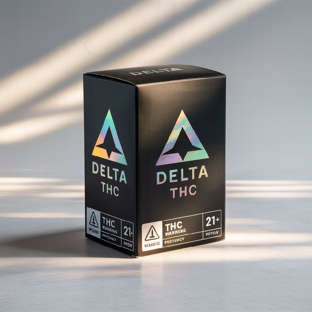
| Surface finish | How the package reflects light and feels in hand | Matte, gloss, soft-touch, spot UV, foil stamping, embossing, debossing | This is where “premium” either feels intentional or overdone. |
| Compliance features | How the pack meets legal and safety expectations | Child-resistant mechanisms, tamper evidence, opaque layers, resealability, warning panels | These are not optional add-ons. They shape the whole design brief. |
The strongest cannabis packaging is almost never the one with the most effects. It is the one where structure, finish, and compliance were designed together from the beginning.
How to spec a package the right way
Before you choose foil, embossing, or any other visual effect, lock in the package spec in this order.
1) Start with the product itself
Is it flower, a pre-roll, a concentrate jar, or a vape cartridge?
Does the product need a strong odor barrier, crush protection, or both?
Does the package directly touch the product, or does it only hold a primary container?
2) Decide what the customer opens first
A bag, a tube cap, a drawer sleeve, and a glass jar all create very different first impressions. A premium exterior cannot fix a frustrating opening experience.
3) Choose your insert before you choose your finish
For example, 420 Packaging’s custom paper drawer box for vape cartridges supports EVA foam, molded paper pulp, cardboard cradle, or PET tray inserts. That one decision changes product security, recyclability, and the feel of the unboxing experience.
4) Reserve compliance space early
If warnings, universal symbols, lot fields, batch/date labels, or tamper seals are treated like afterthoughts, the artwork usually gets crowded fast. This is one of the easiest ways to turn a clean pack into a messy one.
5) Add finish selectively
Premium finishes work best when they create contrast. A matte board with one foil logo and one spot UV highlight typically looks stronger than a box where every panel tries to shine.
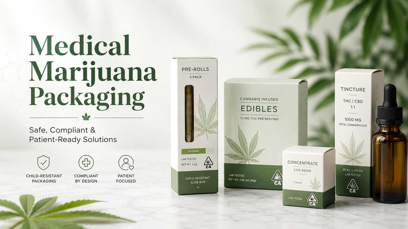
Best packaging processes by product type
The right process depends on the SKU. A finish that looks excellent on a cartridge box can feel unnecessary on a high-volume flower pouch.
| Product type | Best structure | Best process mix | Where brands overspend | Smart recommendation |
|---|---|---|---|---|
| Flower | Barrier pouch or glass jar plus outer carton if needed | Strong barrier, matte or gloss surface, clean labeling, optional child-resistant secondary format | Using premium box finishes when the pouch itself is doing all the work | Use premium printing on hero SKUs only. Keep high-volume strains simpler. |
| Pre-rolls | CR tube, paper tube box, or multi-pack carton with insert | Child-resistant opening, airtight seal, divider insert, selective foil or spot UV | Ignoring how fragile pre-roll tips are during shipping and handling | Spend on fit and seal first, then upgrade shelf-facing panels. |
| Concentrates | Glass jar plus drawer or CR carton | Rigid board, EVA or snug insert, matte surface, small foil accent | Overcomplicated box styles for tiny jars | Keep the footprint small and make the insert do the heavy lifting. |
| Vape cartridges | Drawer box or window carton with insert | Exact cavity sizing, tamper evidence, CMYK plus Pantone, matte or soft-touch with foil/UV accents | Adding a window without planning where mandatory copy goes | Use a clear viewing area only if the compliance layout still stays clean. |
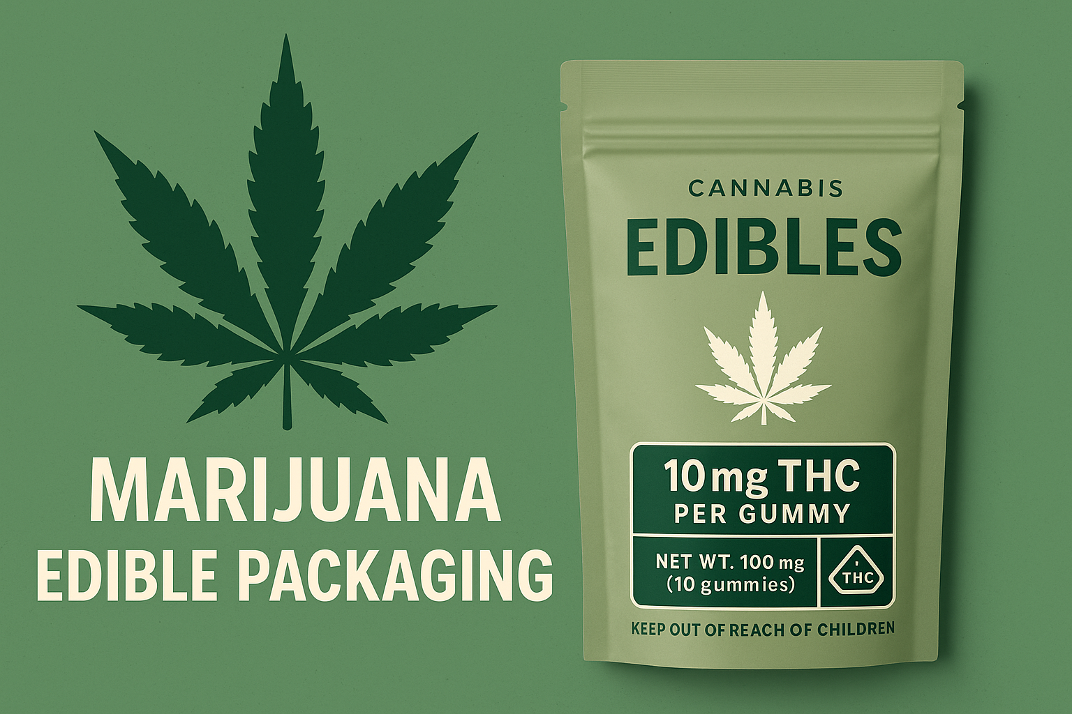
| Edibles | Resealable pouch, carton, or child-resistant jar depending on format | Opaque build where required, tamper-evident seal, durable coating, strong warning panel hierarchy | Designing it too much like mainstream candy packaging | Lead with clarity and safety, then build premium cues around that. |
One pattern shows up again and again: the more delicate or compliance-heavy the product, the less room there is for purely decorative choices.
Finish comparison table: what each process really does
This is the section most teams need before they request a quote. Not every finish improves the package in a meaningful way.
| Process | What it looks or feels like | Best use case | Watch-out | Best pairing |
|---|---|---|---|---|
| Matte lamination / matte surface | Low-glare, premium, modern | Brand-forward cartons, vape boxes, premium pre-roll cartons | Can feel flat if everything is matte and nothing is highlighted | Pair with foil or spot UV for contrast |
| Gloss varnish / gloss surface | Brighter color, more reflective | Bold graphics, value-oriented retail packs, faster visual pop | Can read as less premium for luxury SKUs | Pair with simple artwork and high-saturation color |
| Soft-touch | Velvety, tactile, higher-end feel | Top-shelf carts, concentrates, gift-ready rigid boxes | Usually not the right spend for entry-level or very high-volume runs | Pair with foil or embossing on the logo only |
| Spot UV | Glossy highlight on selected areas | Logos, strain names, key artwork details | Too much spot UV weakens the effect | Works best over matte backgrounds |
| Foil stamping | Metallic shine and strong shelf signal | Brand mark, product family, limited-edition SKUs | Large foil coverage can look heavy and raise cost fast | Use on smaller elements, not entire panels |
| Embossing / debossing | Raised or recessed texture | Logos and simple shapes that benefit from tactile identity | Fine details may not translate well | Excellent with foil or spot UV on the same focal point |
| Die-cut window | Lets buyers see the product or inner tray | Vape hardware, accessories, some non-opaque outer formats | Can create compliance layout pressure and reduce barrier protection | Use only when visibility helps conversion |
| Insert engineering | Changes fit, protection, and perceived quality | Cartridges, jars, fragile multi-packs, premium kits | Often ignored until late in the project | Choose insert before final exterior finish |
| Tamper-evident features | Visible proof of opening or interference | Vapes, edibles, shipping-sensitive retail packs | Bad placement can cover required copy | Plan seal location into the dieline from day one |
420 Packaging’s own finish pages support this logic. The company offers foil stamping, embossing and debossing, varnishing and spot UV, and soft-touch finish. In real cannabis packaging, those processes work best when one of them leads and the others support it.
Compliance checklist for U.S. cannabis packaging
Compliance rules vary by state, but the broad direction is consistent: packages are expected to protect the product, limit child access, show required warnings clearly, and avoid looking attractive to children.
| Requirement area | What to check | Why it changes the package | Official source |
|---|---|---|---|
| Child-resistant | Use a package structure that can document child-resistant performance where your market requires it. | This affects cap style, drawer lock design, button position, and open-close force. | CPSC PPPA FAQs |
| Tamper-evident | Seal or feature should clearly show if the pack was opened or altered. | Placement must not cover required copy. | California DCC Packaging |
| Opaque and resealable | Some states require retail cannabis packaging to stay opaque and resealable, especially for multi-serving products. | This can rule out clear primary containers or single-use closures. | Missouri Packaging, Labeling, and Product Design Guide |
| Product protection | Package should protect the product from contamination, oxygen exposure, and degradation. | This affects barrier film choice, seals, and whether a secondary box is worth adding. | New York Part 128 Guidance |
| Warning and symbol zones | Reserve clear panels for required warnings, universal symbols, lot/date fields, and testing or batch information. | This changes front-panel design and often limits how much decorative finish should be used. | California DCC Packaging |
| Not attractive to children | Avoid visuals that make the product look like mainstream candy or kid-oriented goods. | This affects colors, imagery, mascots, and edible packaging tone. | Missouri Guide |
What this means in plain terms
Do not finalize artwork before you know the exact compliance panel size.
Do not assume a clear jar or a window box is safe for every market.
Do not treat “child-resistant” as a marketing phrase. Treat it as a documented packaging requirement.
Do not wait until late-stage proofing to decide where the tamper seal will go.
Smart workflow: pick the target state, confirm the required warnings and packaging behavior, then build the dieline around those facts. That order avoids redoing artwork and packaging samples later.
Recommended 420 Packaging products to build around
Instead of starting from abstract finish names, it is often faster to start from real packaging structures that already match a product category. The four examples below cover the most common cannabis retail formats.
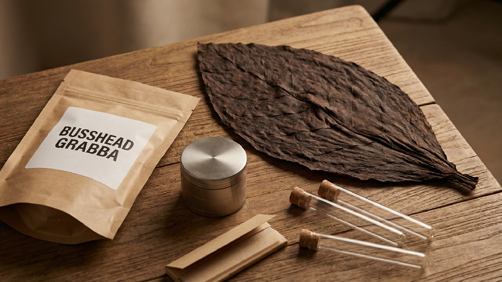
1) Custom Eco-friendly 420 Smell Proof Mylar Bags
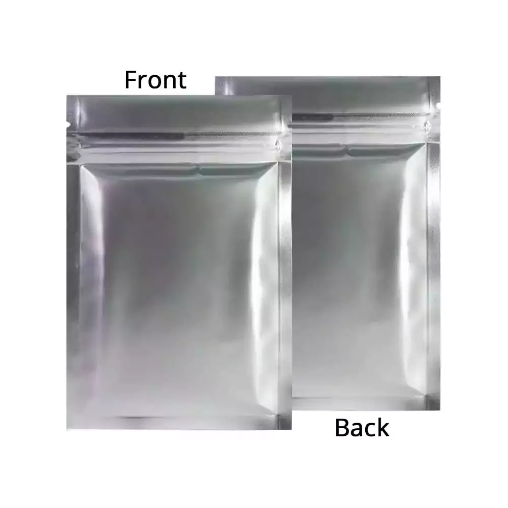
For brands that need barrier performance, flexible sizing, and efficient shipping, this is usually the most practical starting point. On the 420 Packaging product page, these bags are presented as biodegradable, zipper-top, customizable, and available in different materials, shapes, thicknesses, and print options.
Stated price: $0.01–$1.2 per piece
Bag shapes: stand up, flat bottom, side gusset, quad seal, middle seal, back seal, flat pouch
Thickness: 20–200 microns, customizable
Printing: up to 10 colors, CMYK / Pantone
Surface handling: matte or shiny finishing
Best process mix: strong barrier + restrained surface treatment + clean compliance panel
View product page or browse the broader weed bags category.
2) Childproof Pre-Roll Joint Tubes
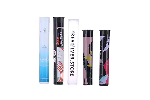
If your priority is freshness, portability, and a child-resistant opening style, pre-roll tubes are one of the clearest format decisions you can make. 420 Packaging describes this option as childproof, tamper-resistant, airtight, durable, and eco-friendly.
Stated price: $0.05–$0.1 per piece
Material: PP
Sizes listed: D19 × H98 mm or D19 × H120 mm
Packing: 500 pcs per carton
Best process mix: child-resistant structure + airtight seal + printed sleeve or label system
Where to spend: fit, cap function, and branding clarity, not excessive decoration
View product page or browse all pre-roll tubes.
3) Custom Paper Drawer Box for Vape Cartridges
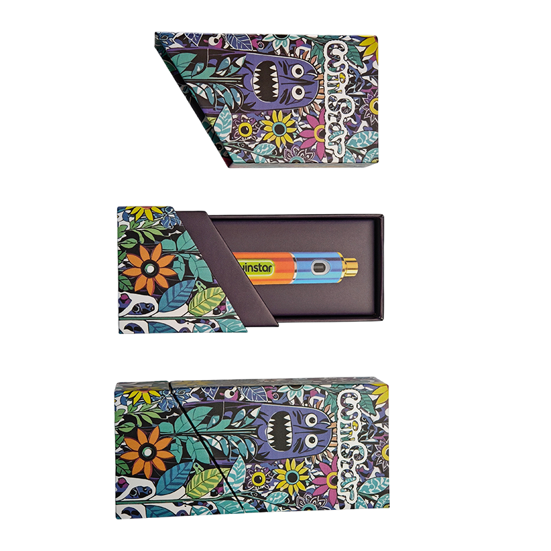
This is one of the best examples on the site of how structure and finish should work together. The product page describes a rigid sleeve-and-drawer design for 0.5 mL and 1.0 mL cartridges, with optional child-resistant mechanisms, full-surface branding, and multiple insert options.
Stated price: $0.15–$2.1 per piece
Fit: 0.5–1.0 mL 510-thread cartridges
Typical cavity guidance: 0.5 mL at Ø10.5–11.2 mm × L52–56 mm; 1.0 mL at Ø10.5–11.2 mm × L62–66 mm
Insert options: EVA foam, molded paper pulp, cardboard cradle, PET tray
Branding options: CMYK + Pantone, inside print, QR, barcode, foil, spot UV, soft-touch, emboss/deboss
Best process mix: matte or soft-touch outer wrap + one focal foil/UV effect + carefully engineered insert
View product page or browse vape cartridge packaging.
4) Child Proof Glass Jar Packaging Box
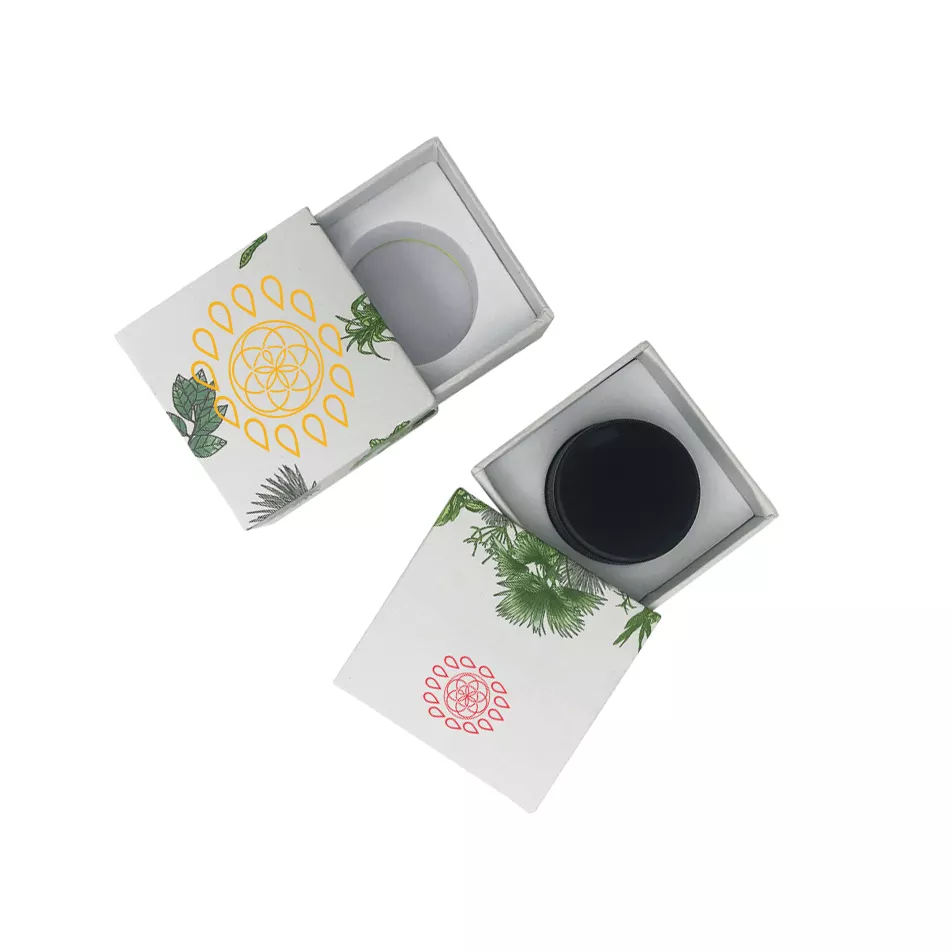
This format makes sense when the jar itself does part of the preservation work, while the outer box adds branding, protection, and a more premium shelf story. 420 Packaging positions this as a child-proof glass jar packaging box with customizable size, food-grade material claims, and custom printing.
Stated price: $0.5–$1.2 per piece
Suggested jar sizes listed: 5 / 7 / 9 mL round or square glass jar options
Material: 1100 gsm cardboard + 157 art paper
Function: packaging with child-resistant button on the side
MOQ listed: 1000
Best process mix: snug insert + matte board + selective logo enhancement
View product page or explore more child-resistant packaging.
Common mistakes that waste money
1) Choosing finishes before choosing structure
A foil-heavy concept board may look exciting, but if the insert is weak or the closure is awkward, the final package still underperforms.
2) Using premium effects on low-value surfaces
Putting expensive embellishment on a format that gets crushed, rubbed, or quickly discarded rarely delivers strong return. Spend where the customer actually sees and touches the pack.
3) Ignoring scuff behavior
Dark, saturated cartons can show wear faster than buyers expect. Soft-touch and matte finishes can look excellent, but only when the board choice and handling conditions are considered early.
4) Forgetting that inserts are part of the brand experience
A loose cartridge, rattling jar, or bent pre-roll tells the customer the packaging was under-engineered. That problem cannot be hidden with better artwork.
5) Treating compliance copy like leftover text
Warning zones, universal symbols, lot fields, and tamper evidence should be part of the design system. Not the last layer added before print approval.
6) Trying to make every SKU feel “limited edition”
Reserve your most expensive process stack for the products that need it most: flagship strains, collabs, seasonal drops, and premium concentrate or vape launches.
The RFQ checklist to send before you request a quote
If you want cleaner quotes and faster sampling, send this information up front.
Product type and exact fill or fit dimensions
Primary format: pouch, tube, jar box, carton, drawer box, or kit
Whether the package directly touches the product
Target market and state packaging requirements
Need for child-resistant, tamper-evident, resealable, or opaque features
Artwork files and whether Pantone matching is required
Desired finish stack: matte, gloss, foil, spot UV, soft-touch, emboss/deboss
Insert preference: EVA, pulp, PET, cardboard, no insert
Expected order quantity and timing
Whether you need plain sample, printed sample, or both
Best practice: if you are still deciding between two structures, ask for both plain samples first. It is much cheaper to discover the wrong opening experience before printed sampling starts.
FAQ
What is the most common premium finish used on cannabis packaging?
Matte plus one accent finish is the most dependable premium formula. In real projects, that usually means a matte surface with either foil or spot UV on the brand mark or strain name.
Is foil stamping worth it for every cannabis SKU?
No. Foil works best on hero products, small focal areas, and premium launches. It is not the most efficient use of budget for every daily-volume item.
Should I use a box or a bag for flower?
For many flower programs, a well-built barrier pouch is the practical base format. A box becomes more useful when you need stronger shelf presence, a child-resistant outer format, or a more gift-like presentation.
What matters more for vape packaging: finish or insert?
Insert. If the cartridge fit is loose, the package will feel lower quality no matter how good the print finish looks. Finish should follow fit.
Can I use clear windows on cannabis packaging?
Sometimes, but only if the target market allows it and the remaining panel space still handles required warnings and symbols cleanly. Do not assume a window works in every state or every category.
What is the safest way to reduce cost without making the package look cheap?
Simplify the finish stack before you downgrade the structure. A clean matte carton with a good insert usually looks better than a weak structure covered in too many visual effects.
Final takeaway
The best cannabis packaging process is not the one with the longest list of embellishments. It is the one that matches the product, fits the compliance reality of the market, protects the contents, and creates a shelf experience your customer can understand in seconds.
If you are comparing real-world options right now, start with the formats that already align with your SKU: pre-roll packaging, pre-roll tubes, weed bags, cartridge packaging, and broader packaging solutions. That route leads to better packaging decisions much faster than chasing finish names in isolation.